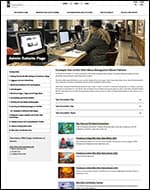
Web Styleguide
The Web Styleguide is a collaboration of Marketing/Communications and Web Services serving as a series of templates and solid examples for Web Editors to reference when creating pages and editing their sites.
The following links serve as standardized examples of how the Providence College pages should be constructed in order to be consistent technically and to follow brand standards.
Academic Sites
Administrative Sites
Advancement & Alumni Sites
Main Navigation for All Sites
Main navigation must include the following-
- Left-most navigation item must link back to the department home and labeled as such- example “Web Services Home”.
- Must not link to 3rd party sites. Should not link to other providence.edu sites- if you need to link to another providence.edu site, ensure that it opens in a new tab/window. Main navigation links should link to either sub-sections, or major documents within the department.
Subsite/side Navigation
The PC Side Navigation Menu block is used to create a subsite- a group of pages that share a related topic or purpose as a site-within-a-site. Using this block enables the viewers to easily navigate between the different pages within a subsite, while also allowing them to return to the main page of the subsite. When creating a subsite using this block, there are a couple of rules:
- All PC Side Navigation Menu blocks on pages within a subsite must use the same menu. It is fine to have multiple subsites housed within a site, just ensure that all of the pages within each subsite uses the same unique menu compared to the menus on other subsites. This creates a logical viewing experience for the audience, allows for predictable navigation, and is consistent with other providence.edu subsites.
- Subsite navigation must not use the same menu/links as main site navigation. Multiple links on a page leading to the same location can cause confusion, is redundant, and also creates accessibility issues for folks using screen-reader software.
Academic Sites
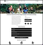
Academic Department Home Page
Academic Department home pages should be set up to use the following elements-
- Page must use the “Landing Page- No Sidebars” template
- Must have a web-optimized 1900 pixel wide by 400-600 pixel high banner image.
- Page title option must be set for below the banner image.
- Insert a content wrapper set at 900px wide on the page and add all page content beneath the banner block within it.
- Must include generic contact information for the department. Can include (but not recommended) specific contact information for key contact personnel.
- Must include degree information accordion menus, Beyond the Classroom, Faculty Profiles link, In the news, After PC, Selected Places of Employment/Service, Selected Graduate Schools. May include additional contact information and other elements as needed.
Administrative Sites
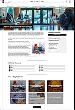
Administrative Department Home Page
Administrative Department home pages should be set up to use the following elements-
- Page must use the “Landing Page- No Sidebars” template
- Must have a web-optimized 1900 pixel wide by 400-600 pixel high banner image.
- Page title must be set to be inserted within the black bar.
- Insert a content wrapper set at 1500px wide on the page and add all page content beneath the banner block within it.
- Must include generic contact information for the department
- Optional page elements include the panel of links (if the department needs to link to additional pages, subsites, or documents), News/Blog feed and other elements/blocks as determined.
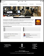
Administrative or Academic Department Interior Page
Interior pages are intended to hold various pieces of information including links to documents, other sites, blog post list, news, announcements, and images. Due to the variety of content types, these pages can vary widely in appearance. Reach out to Web Services if you’d like guidance.
Administrative or Academic Department interior pages should be set to use the following elements-
- Page must use the “default” page template.
- May or may not use a web-optimized banner image across the top of the page. Image should be 1900 pixels wide by whatever height works best for the image content. Use of banner image is at the discretion of the department- some pages/content don’t lend themselves to having an image that embellishes the content well. For pages with a banner image, the page title should be in a black bar. For pages without, the page title should be above the page content wrapper.
- Insert a content wrapper set at 1500px wide on the page and add all page content beneath the banner block within it.
- Must include generic contact information for the department at the bottom of the page. May include specific personnel contact information if needed as well, but it is not recommended.
- Optional page elements include the panel of links, news/blog post feed, additional buttons, or other blocks as necessary.
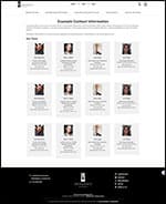
Administrative or Academic Department Contact Page
Contact pages are meant for displaying contact individual contact information for a department in a logical, clean, and consistent manner.
Administrative or Academic Department Contact Pages should be set to use the following elements-
- Page must use the “default” page template.
- May or may not use a web-optimized banner image across the top of the page. Image should be 1900 pixels wide by whatever height works best for the image content. Use of banner image is at the discretion of the department- some pages/content don’t lend themselves to having an image that embellishes the content well. For pages with a banner image, the page title should be in a black bar. For pages without, the page title should be above the page content wrapper.
- Insert a content wrapper set at 1500px wide on the page and add all page content beneath the banner block within it.
- Contacts can be set up in 1, 2, 3, or 4 column blocks depending upon the number of contacts- choose whichever makes most sense to you and the number of personnel.
Administrative or Academic Department Subsite Page
Subsites are “sites within a site” – usually a cluster of pages devoted to a similar topic containing related information. For ease of use we use a PC Side Navigation Menu block – to make it easier to navigate between the related pages quickly and easily.
Administrative or Academic Department Subsite Pages should be set to use the following elements-
- Page must use the “default” page template.
- May or may not use a web-optimized banner image across the top of the page. Image should be 1900 pixels wide by whatever height works best for the image content. Use of banner image is at the discretion of the department- some pages/content don’t lend themselves to having an image that embellishes the content well. For pages with a banner image, the page title should be in a black bar. For pages without, the page title should be above the page content wrapper.
- Insert a content wrapper set at 1500px wide on the page and add all page content beneath the banner block within it.
- Within the content wrapper, before adding any other content, insert a two-column block, 1/3 column on the left, 2/3 column on the right. Leading content on the page can go in the 2/3 column, and the PC Side Navigation Menu block must be inserted within the 1/3 column on the left. Additional content (buttons, picturelinks, text etc) can be inserted directly beneath the PC Side Navigation Menu block if desired.

