
What Are Decorative Images?
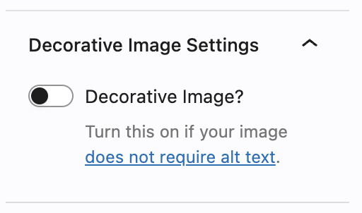
If you’ve added an image to a page or post in the WordPress editor recently, you may have noticed a “Decorative” checkbox option. It’s a small toggle with a big purpose. Understanding when to use it, and when not to, is an important decision for accessibility.
First, some foundational accessibility info
When a screen reader encounters an image on a web page, it reads the image’s alt text aloud to the user. Alt text is your opportunity to describe what the image shows and why it matters. Without it, screen reader users either hear nothing, hear a confusing filename like DSC_0047_final_FINAL.jpg, or miss information entirely.
The purpose of alt text is to convey the meaning of an image to someone who can’t see it. But here’s the important nuance: not every image has meaning. Some images are purely visual decoration. They make the page look nicer, but they don’t tell you anything you couldn’t learn from the surrounding text. For those images, an empty alt attribute (alt="") is the correct, standards-compliant approach. It signals to screen readers: “skip this, there’s nothing here for you.” That’s exactly what our Decorative toggle does automatically.
IMPORTANT NOTE: Later this spring, we will be strictly enforcing the alt text/decorative images policy. This means that any images on your site that do not have alt text, and that are not specifically marked as decorative using the switch above, will be marked as accessibility violations on your DubBot reports. So be sure to check your pages for images that need attention!
What counts as a decorative image?
A decorative image is one that:
Exists for visual aesthetics only. A background texture, a colored divider, a swirly banner pattern — these set a mood or fill space, but they carry no information.
Or:
Is fully described by adjacent text. If a photo of the Ruane Center appears in a story that’s entirely about the Ruane Center, the image isn’t adding new information — it’s illustrating what the text already says. Unless it’s specifically showing a part of the building that is not already described in the text, redundant images can be marked decorative.
Or:
Is a functional or design element. Decorative icons used purely as visual bullets, abstract geometric shapes used for layout structure, or stock photos chosen only to break up a wall of text all fall into this category.
What does not count as a decorative image?
This is where editors sometimes get tripped up. An image is not decorative if:
It shows something the text doesn’t say. A photo of a student at commencement isn’t just decorative if that student is captioned and identified — the image conveys who this person is. (But if there is a caption that clearly describes the image already, the image should be marked as decorative.)
It contains text. Infographics, charts, posters, flyers, and event announcements presented as images must always have alt text (or a longer text alternative), even if they look like simple graphics.
It communicates an emotion or context that the text relies on. If the page says “see the excitement on students’ faces,” then the photo of those students is doing meaningful work.
It’s the only way to understand something. A campus map, a diagram of a process, a photo showing the correct way to complete a form — all of these are informative, not decorative.
It’s a link. If an image is clickable, its alt text must describe where the link goes, even if the image itself seems generic.
A useful test
Ask yourself: If this image disappeared, would a reader miss any information? If the honest answer is no, the page would make just as much sense without it, then the image is likely decorative. If the answer is yes, or even maybe, write alt text.
The link in the sidebar adjacent to the Decorative Image switch can help you work through ambiguous cases. When in genuine doubt, a thoughtful alt text description is always preferable to marking something decorative and moving on.
Why this matters
Marking an informative image as decorative isn’t just a missed opportunity — it’s a compliance gap. At the same time, writing unnecessary alt text for truly decorative images creates noise for screen reader users, who have to listen through it to get to content that actually matters. Getting this right is a form of respect for every visitor who uses our site.
The bottom line for editors
Our Decorative toggle exists to help you make pages more accessible, not to let you skip alt text. Use it confidently when an image truly has no informational value — it saves time for visitors. Write alt text thoughtfully when an image says something your words don’t. If you’re unsure, write the alt text — it takes only a few seconds, and it makes someone’s day on our site better.