

Module 3: Web Accessibility Essentials
Module 3: Web Accessibility Essentials
What You Will Learn in this Module
In Module 2, we covered the importance of content quality, content ownership, and decision-making for responsible web publishing. Module 3 expands the scope of that responsibility by focusing on web accessibility and the ways your content choices affect whether everyone can access, understand, and use the information you publish.
Accessibility is not simply a technical requirement handled behind the scenes. While Web Services is responsible for the accessibility of the systems, themes, and components that make up Providence College websites, Web Editors play an equally important role. The way you write and organize content, describe images, create links, use headings, and publish multimedia can determine whether a page is accessible to people with disabilities.
This module introduces some of the different ways people experience and navigate the web, including people who use screen readers or keyboards, people with low vision or color-vision differences, D/deaf and hard-of-hearing users, neurodiverse users, people with dyslexia, and people with motor disabilities. Understanding these experiences provides the context for the practical accessibility skills you will learn.
By the end of this module, you should be able to:
- Explain why web accessibility is an essential part of responsible web publishing.
- Recognize some of the different ways people with disabilities access and navigate web content.
- Determine when an image needs alternative text and when it should be marked as decorative.
- Write useful, context-appropriate alternative text.
- Write meaningful link text that makes sense outside its surrounding content.
- Organize pages with a logical, properly nested heading structure.
- Recognize accessibility concerns involving color, visual presentation, audio, video, and other media.
- Understand how accessibility practices can also improve usability, search-engine optimization, and content quality.
- Use Providence College’s accessibility tools and resources to identify and address problems.
- Know when to contact Web Services for help with an accessibility question or issue.
Module 3 Content
Department of Web Design/Development, Architecture, & Services
Martin Hall Room 302
401.865.1755
web@providence.edu
Module 3 is about equitable access. Publishing information on the web is not enough if some people cannot perceive, understand, navigate, or interact with it.
3A. What is Web Accessibility?
Why create accessible content?
Most importantly, it is the right thing to do, and it is consistent with the values of our institution.
Second, it only makes sense – when you create web content, you’re creating it for other people. It’s important that other people, all other people, have access to that content, no matter what tools they use to navigate the web. It can only benefit you to make your message available to as many interested visitors as you can.
And finally, there are consequences for having inaccessible content. It exposes the College to both reputational and legal risk.
3B. Types of Users
Users of Screen Readers
A screen reader is a piece of software that reads the content of a computer screen loud. Screen readers may be used by people who are blind or have low vision, who have challenges processing written text, or who otherwise benefit from spoken, rather than visual content. Watch the following video for some insight into how some people with disabilities use the web.
In order to make sure your website works on a screen reader, Web Services is constantly working behind the scenes to improve the technical aspects of your website.
Fixes for screen readers also have the beauty of being good for search engine optimization. If a screen reader can understand your content, so can a crawler compiling information for Google.
Screen Readers and Alternative Text
There are some things you can do to make your website more accessible to screen reader users. The most important (and easiest) way to do this is writing alternative text (alt tags) for your images. This is as much an art as a science, but it is critical for Web Editors to recognize the importance of including alternative text when needed (and avoiding it when appropriate!).
Screen Readers and Heading Order
Another important area for screen reader compliance is your headings. Your headings should be in order, so that they form a document outline. Headings should not go, for instance h1 then h3. A h2 should be nested inside an h1, and a h3 should be nested a h2, and so forth. There are other important issues around headings, which you can read more about in our guide to headings.
Screen Readers and Link Text
Just as with the headings, a screen reader user often isolates all the links on a page. Hearing “click here” 12 times is not helpful. Instead, you should describe the action and content of the destination.
You can find more information in our guide to writing link text.
Remember:
Make sure all your content is readable text. No images of words, no audio or video content without transcripts.
Users with Vision Differences
Many of the advice useful for a screen reader above is also relevant for users with low vision. However, when we say users with low vision, we generally imagine they are using a traditional web browser to view the website, rather than a screen reader or braille display.
You should make sure that all content is presented in readable sections at sensible length and visible text size, broken into digestible segments, with visual breaks. (Bonus: research suggests this helps all users, not just users with low vision, to understand this kind of the content more easily.)
Color contrast must be sufficient so that people with color blindness can perceive everything on your webpage. Our theme’s basic colors of black text on a white background is compliant, so this is especially important when creating images. Our WordPress color palettes can help you ensure that your text and backgrounds have sufficient contrast, as well.
“Low Vision” encompasses a variety of optical conditions. You may find it instructive to see our webpage as users with low vision might see it.
Blurry and dim vision
Macular degeneration
Retinitis pigmentosa (tunnel vision)
Deuteranopia
Protanopia
Tritanopia
There are many types of low vision conditions and color blindness. We, as content creators and developers, have a responsibility to create content that offers an equitable experience to all users.
Neurodiverse Users
Like many of our other user groups, when we refer to users who are neurodiverse, we are referring to a wide variety of user experiences.
To account for users with various neurotypes, a few simple rules should be followed.
- Clear Layout: Use simple designs with plenty of white space so pages do not feel crowded or confusing.
- Plain Language: Write text in short, simple sentences and avoid heavy jargon or complex idioms.
- Predictable Navigation: Keep menus and buttons consistent across pages.
- No Flashing or Moving Content: Stop all blinking, flashing, or moving animations that can cause sensory overload or distraction.
- No Auto-Play Media: Let users choose when to start videos, audio, or moving graphics.
- Customizable Text: Allow users to change font sizes, line spacing, and background colors to fit their reading needs.
Deaf or Hard of Hearing Users
While we don’t use a great deal of audio or video on our site, there are a few important actions you can take to best serve hard of hearing or D/deaf users.
- Make sure no content is presented in entirely audio format.
- All content that includes sound should have a full text alternatives – this means audio files must have complete transcripts, and video files must have accurate synced captions.
- When requesting user information, the telephone number should not be the only communication information you collect — always allow users to get in touch with you via email or text, as well.
Users with Dyslexia
For users with dyslexia, the previous standing advice prevails: use clear, consistent layouts with short, concise content.
Keep the text left aligned and avoid indiscriminate use of bold or italics. Never underline text unless it is a link.
Dyslexic users may also benefit from illustrative pictures that clearly relate the message of the content, as well as supplementary content in audio and video formats (which is also in itself made accessible).
Users with Motor Disabilities
Many of the web features necessary support users with physical or motor disabilities are performed by Web Services on the technical side. These include constantly evaluating and improving the keyboard navigability of the site, and providing large text and touch targets for those users who might use a touch screen.
There are some steps, however, that web editor should take to make their web page more accessible for users with physical or motor issues.
- Provide lots of space between links, so that it isn’t difficult to select any particular one. If you have multiple links in one paragraph, consider breaking your text into multiple paragraphs.
- Limit the size of a page, or include navigation links (e.g. a table of contents, and a “return to top” link for each section).
3C. Creating Accessible Content
Looking for specific information about how to create accessible content? We’ve created the guides below, which are required as part of Web Editor training.
Writing Alternative Text
When to Write Alt Text
All images on our website should have alternative text associated with them, unless they are strictly decorative images. If the image is being used to convey information, even simple/basic information, it should have alt text. However, if the image is strictly decorative, it is best to leave the alt text blank, and not waste the time and processing resources it requires.
The most important cues to when an image is decorative or not lie in the context of the page, the content, and the reason the image is there. Is there any information in the image that is relevant or useful? Is the image only used to break up text? Does it convey information? The same image used in different contexts may require alt text in some cases, but not in others.
How to Write Alt Text
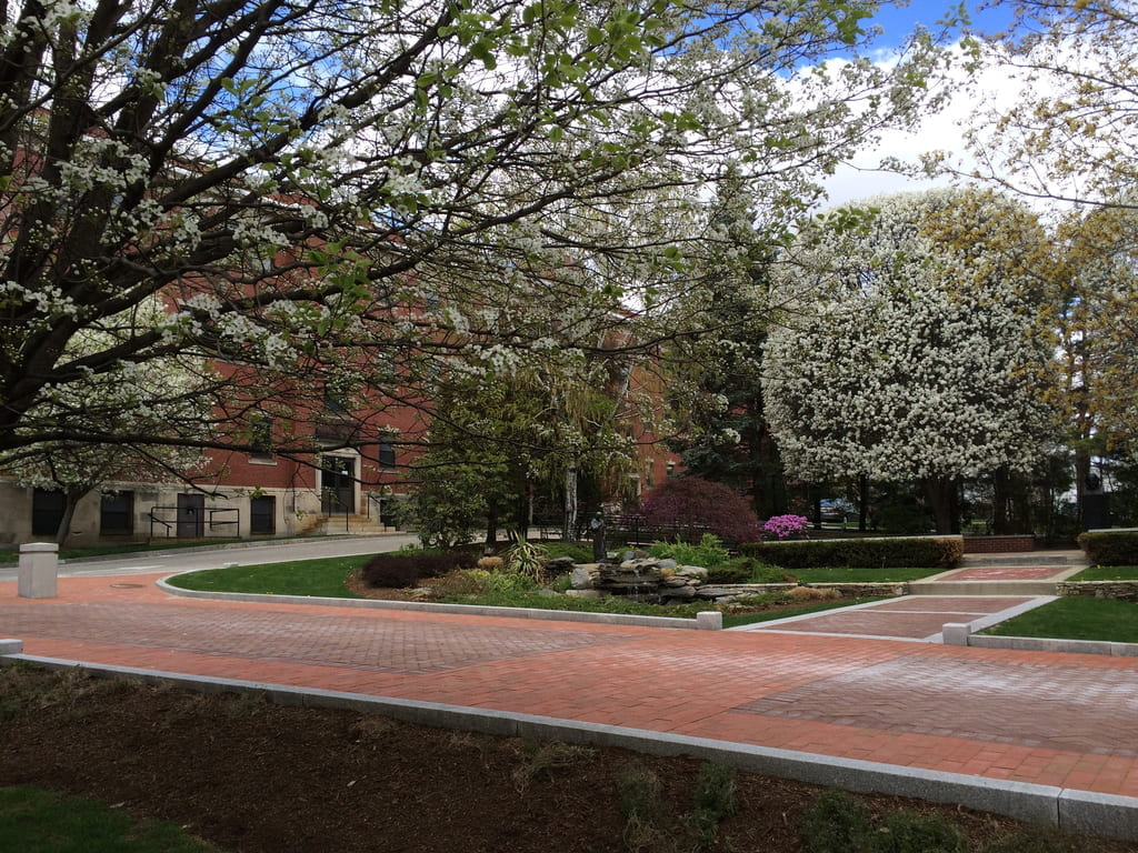
Consider that the image below is used in a campus tour, showing the St. Martin de Porres sculpture in the court. Let’s consider the scene and write some alt text together.
Example 1 ❌
“A picture of some trees”
One common mistake people make when writing alt text is to announce that they are describing a picture.
This is not helpful to a screen reader – in fact, screen readers generally announce in some way that they are about to read the text describing an image, so saying “a picture of” or “a photo of” is unnecessary.
Example 2 ❌
“Campus Tour Stop #4”
This image does not communicate anything about the number of the tour stop. Presumably, the fact that it is the fourth stop on the campus tour is already outlined in the page content. Instead, we should be describing what one would encounter when visiting stop #4, and rely on the context around the image to describe why it is relevant.
Example 3 ✅
“A small bronze statue of St Martin de Porres overlooks a koi pond, surrounded by large blooming trees in the Rev. Thomas M. McGlynn, O.P. Sculpture Court on the Providence College campus.”
This language meets all the criteria for properly written alternative text. We start by deciding the context — since the image is used to specifically represent a place, it is not considered a solely decorative image. The most important or focal point of the image in this case is the statue, so we mention that first. The koi pond is also an interesting part of the image, and so should be mentioned. The trees provide some context as well, that the scene is of nature, and then the mention of the sculpture court is at the end, the least important part of the description. When deciding whether or not to write comprehensive alt text, realize that someone using a screen reader may stop the reading of the description once they have the information they need — so keep the most important descriptions at the beginning of the alt text. Despite the fact that the image does not itself communicate anything about the sculpture court (other statues are not visible in the image), anyone who is familiar with the space will be able to use that information to contextualize the location where the photograph was taken.
How to Leave it Blank (decorative images)
Decorative images do not convey useful information in the context of the content of the web page, or do not additionally contribute to information already on the page.
See the section below on How to Add Alternative Text in WordPress for specific instructions on how to treat decorative images in WordPress.
Text in Images
Unless it is expressly required, do not overlay text on your images. It typically will not scale well between mobile, tablet, laptop, and desktop screen sizes, and the text is not available to screen readers. However, if you absolutely must use text in an image, you are required to make sure that all information in the image is conveyed through the alt text.
Images, or captions?
If an image has a visible caption that describes it, the description should not be repeated in alt text. If the caption is not quite sufficient to meet the needs of alt text, add supplemental information in alt text. Otherwise, the caption should stand, and you should mark the image as decorative.
Resources for great alt text
- There are many good and interesting guides to writing alt text. One of the most useful is the “alt decision tree” published by the w3.org.
- Moz, an SEO group, has several good examples for what makes a good and bad alt text.
- The Penn State guide is simple, and quickly communicates the important details about writing alt text.
How to Add Alternative Text in WordPress
Add Alternative Text in WordPress
Adding alternative text (alt text) to images in WordPress is required for both accessibility and search engine optimization. Alt text provides a clear description of an image, enabling screen readers to convey its content to users with visual impairments while also helping search engines understand your page. This guide explains two accessible methods to add alt text. Remember, the Title field should remain empty since it isn’t intended for alternative text.
How To Example 1: Adding Reusable Alt Text in the Media Library
When you upload an image via the Media Library, you’ll see a dedicated field for entering alt text. Enter a concise, descriptive phrase that accurately reflects the image’s content or function. Adding the alt text within the media library will automatically populate the alt text field in the editor whenever you include this image in a page or post. Always leave the Title field blank to avoid redundancy.

How To Example 2: Adding Alt Text Within the Editor

When editing a page or post where you’re inserting an image, you can easily add alt text directly from the editing interface. After inserting the image, click on it to reveal a settings panel on the right-hand side of the screen. This panel includes an alternative text field where you can type a clear, informative description of the image. If alt text was previously added in the media library, as above, the field will automatically be populated, but you can edit the alt text for this instance of the image in this page.
How To Example 3: Using Decorative Images
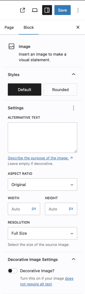
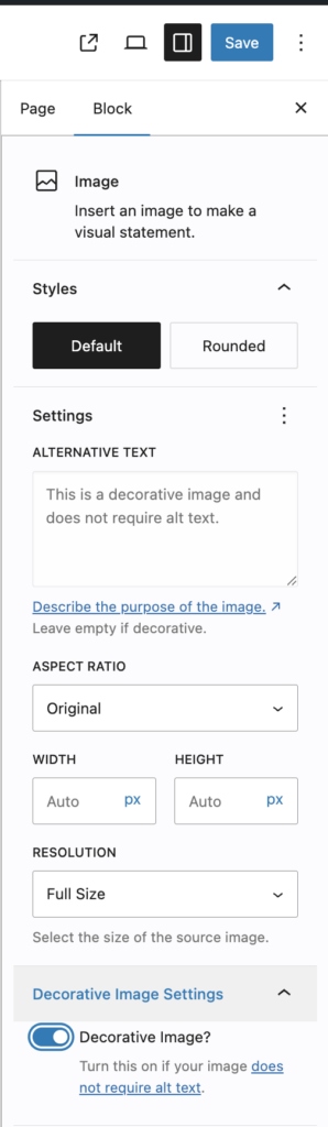
Decorative images are images that don’t convey information, but are simply used to make the visuals of a page more appealing. Decorative images not only do not need alt text, they specifically should not have alt text. Including alt text on decorative images is a violation of accessibility rules — it causes unnecessary time to be wasted for screen-reader users. One rule of thumb for decorative images: If the information on the page would be complete if the image were not there, you should consider it decorative.
You should use the “Decorative Image” slider at the bottom of the Image Block sidebar to explicitly set the image to “Decorative”. (Compare the bottom of the images here, and the message in the Alternative Text box.)
Writing Link Text
Link text is one of the first things screen reader users encounter when navigating a page, since many users will pull up a list of all links to move around quickly. In addition, sighted users tend to scan for links rather than read straight through. That means people don’t always encounter a link in the order you wrote it, so each link has to make sense on its own, without the surrounding sentence to explain it. When that list of links is full of vague phrases like “click here” or “read more,” it becomes useless for deciding where to go (and it is terrible for search-engine optimization, as well).
Your link text should accurately and meaningfully describe the link destination, so that someone reading the link on its own knows where it goes and what they’ll find there. A good test: if you covered up everything around the link, would the link text alone still tell you what clicking it does? “Spring semester course offerings” passes; “click here” or “learn more” doesn’t. Aim for text that’s specific enough to be unambiguous but short enough to stay scannable — usually the name of the destination or the action it performs, not a full sentence.
Examples:
(Bad) Example 1: Open source software is software with source code that anyone can inspect, modify, and enhance. Click here to find out more.
Imagine you are a screen reader user and you are searching the page for links (which is a common use case for screen reader users). If you hear “Link: Click here to find out more” without context, it may not be very helpful. Instead, consider the following:
(Better) Example 2: Open source software is software with source code that anyone can inspect, modify, and enhance. Click here to find out more about open source software.
or for the best accessibility, rewrite your content to make the link text work for you:
(Best) Example 3: Open source software is software with source code that anyone can inspect, modify, and enhance.
Links that open in a new tab
Forcing links to open in new tabs is disruptive, something that holds true for both mobile usability and accessibility concerns. For this reason, it’s best to not open links in a new tab and allow users’ default behaviors to take precedence.
However, if you absolutely must open a link in a new tab, you have to convey that information in the link text. It is highly disruptive to users with cognitive accessibility concerns, as well as some screen reader users, to switch to a new browser tab or window without warning, so be sure your text links reflect that they will open in a new tab, if you’ve chosen to do that.
Page and Section Headings
Headings are the labels you apply to a line of text to mark it as a section title — Heading 1 through Heading 6. In the block editor, you set them by adding a Heading block and choosing its level (H2, H3, and so on) from the block toolbar.
Heading level 2
Heading level 3
Heading level 4
etc.
You’ll note that these headings decrease in size, but you should never use headings solely to adjust the size of your text. Headings have semantic meaning, not just size attributes.
Headings are one of the most important tools screen reader users have for navigating a page. Most screen readers can pull up a list of every heading on a page and jump straight to the section the user wants — so headings function like a table of contents that assistive technology builds automatically from your markup. Think of your headings the way you’d think of the outline of an essay: Heading 1 is the page title, which is handled by WordPress. Heading 2s are your main points, Heading 3s are the sub-points beneath them, and so on down.
Anyone who’s outlined a paper knows you don’t jump from a top-level point to a third-level detail without the level in between — heading structure works exactly the same way. A user can also move heading by heading through a page to get its overall shape before deciding where to read. When headings are missing, mislabeled, or faked with bold text, that entire navigation system falls apart, and those users are left scrolling blindly through the whole page. Sighted users benefit too — they scan headings to find what they need — but for screen reader users, good headings are often the difference between a usable page and an impenetrable one.
It’s easy to forget, given the commercial and interactive nature of the internet, but the web was created to share text documents, and a webpage is still meant to have a clear underlying structure. When you mark something as a heading, you’re not just making it bigger — you’re telling assistive technology “this is the title of the section that follows.” That structure is invisible on the surface but essential to how many people navigate.
A few simple rules
- Go down heading levels in order, without skipping. If your page title is Heading 1, your first section is Heading 2, a subsection under it is Heading 3, and so on. Don’t jump from Heading 2 to Heading 4 because you prefer how it looks — to a screen reader user, that gap signals that a subsection is missing.
- Every page needs one main heading (Heading 1), and it can’t be empty. On our sites, the page title automatically becomes the Heading 1, so in your own content you’ll almost always start at Heading 2. You generally won’t need to add a Heading 1 yourself.
- Write headings that describe the section that follows, in clear and concise language. “Web Professional Development” tells the reader exactly what’s below it; “More info” or “Details” tells them nothing. Remember that a screen reader user may hear this heading with no surrounding context, pulled out into a list — so it has to make sense on its own.
- Never fake a heading with bold, and never pick a heading level for its size. If a line is a section title, use an actual Heading block so the structure is real. If it’s just a word you want to emphasize mid-sentence, use bold or italics. And if a properly-leveled heading doesn’t look the way you’d like, that’s a design question, not a reason to change its level — contact Web Services and we’ll help adjust the styling.
A bonus: Headings help your SEO, too
The same clear, well-structured, descriptive headings that help screen reader users also help search engines understand what your page is about and how it’s organized. Search engines read your heading structure to figure out the topic and hierarchy of your content, so a page with meaningful headings in a logical order tends to be easier to find. Accessibility and discoverability go hand in hand — doing right by your readers who use assistive technology also does right by everyone trying to find your page in the first place.
3D. Get Help – How to test your site’s accessibility, and where to go if you have questions

Providence College provides Web Editors with access to the premium quality assurance tool DubBot. DubBot use is required for all faculty/staff Web Editors, and you will receive access once you complete your certification training. You will learn more about DubBot in Module 5: DubBot Training.
If you have any questions about your site’s accessibility, please reach out to the web accessibility coordinator. We are here to help!
3F. Optional Additional Learning
3G. Key Takeaway
Accessible web content is content that people can perceive, understand, navigate, and use regardless of disability or the technology they use to access the web.
As a Web Editor, you do not need to be an accessibility expert or solve every technical accessibility issue yourself. Your role is to make accessible choices when creating and editing content — including using appropriate headings, meaningful link text, useful alternative text, and accessible approaches to images and multimedia.
Accessibility is a shared responsibility. Web Services works to ensure that Providence College’s websites and technical components are accessible, while Web Editors help ensure that the content published within those systems is accessible.
When you are unsure how to make something accessible, or encounter an accessibility problem you cannot resolve through the editing tools available to you, contact Web Services for help.
Next – Module 4: WordPress Basics
In the next module, you will begin working directly with Providence College’s WordPress editing environment. Module 4 will introduce the basic tools and screens you will use to find, edit, and maintain your assigned web content.
Module 4 will cover topics such as:
- Accessing Providence College WordPress sites.
- Navigating the WordPress dashboard.
- Finding and editing existing pages.
- Understanding the basic WordPress editing interface.
- Working with common areas such as Pages, Media, Contacts, and Appearance.
- Recognizing the difference between routine content editing and changes to site structure.
- Knowing when navigation, layout, or structural changes should be discussed with Web Services.
- Finding additional help and training.
Modules 2 and 3 introduced the editorial and accessibility principles behind responsible web publishing. Module 4 begins putting those principles into practice by introducing the tools you will use to maintain Providence College websites.