

Color Palette Refresh
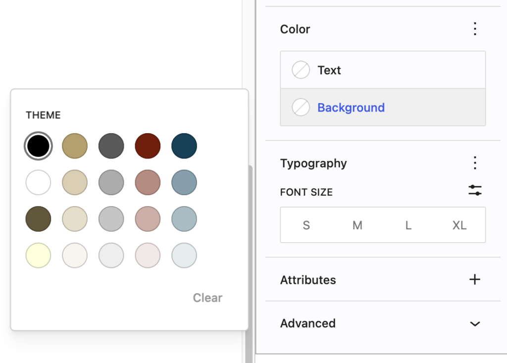
This week, we’ve refreshed our WordPress color palette! The colors aren’t really new — we haven’t changed the heart and soul of our brand — but you’ll notice that there are several new options that are lighter and darker versions of our original brand palette.
We hope these new shades will make it easier for you to create dynamic web experiences, while supporting the College’s need for accessible content.
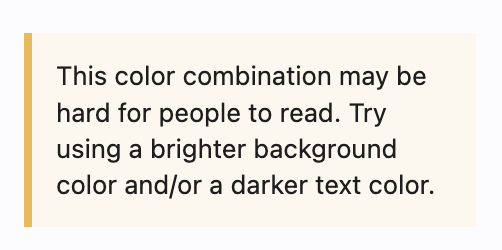
The new palette gives us the ability to guide you when choosing text and background colors. If the combination you select is likely to present an accessibility challenge for web visitors, you’ll see an alert underneath the Color section of the sidebar:
We hope this change helps you communicate better with visitors to your website. As always, if you have any questions or need help with your website, Web Services is here to help!