By the Numbers / Fast Facts – PC Custom Blocks
Overview
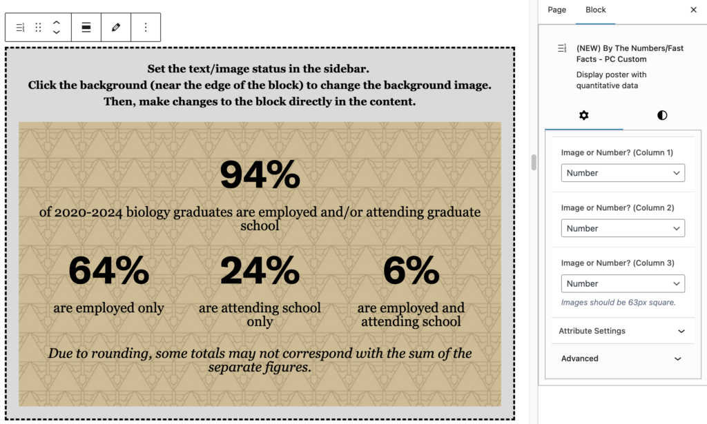
The By the Numbers block creates a full-width panel which typically accepts three numbers, and then some descriptive text. It accepts numbers (which are displayed in large type at the top of the column) with smaller size text underneath. There’s also a large background image or color block as a background.
New in Spring 2026: The By The Numbers block now supports images, as well as text, in what has historically been the “number” field.
To use an image instead of a number, select the block, and choose “Number” or “Image” from the dropdown for each column (default is number — see screenshots below). Choosing image inserts a placeholder, which you can then replace with an image from your Media Library by clicking on the image placeholder.
NOTE: Images used in this block should be SQUARE ONLY, and should display at 63px by 63px. The ideal use case is replacing the number with an icon, arrow, or other one-color indicator. The source image works best if it is created at approximately 128px by 128px, but should never display larger than 63px on a side within the block.
What does it look like?
This is the heading
Some introductory text can go here.
7
Days in a week

Honeybees are important
52
Weeks in a year
There is an optional place for a bit of extra text at the bottom, as well.
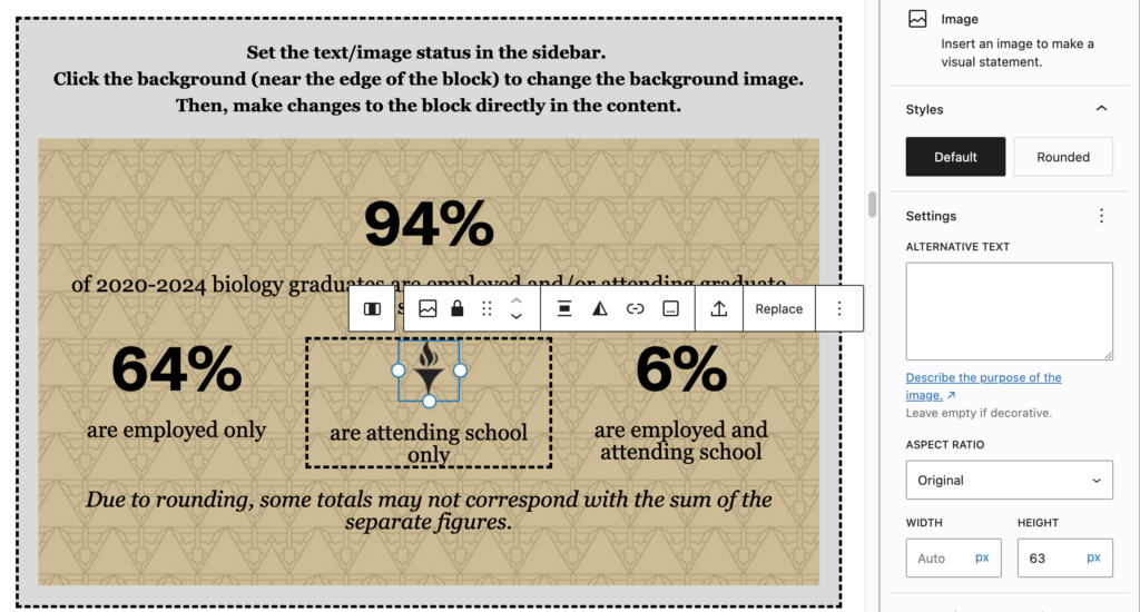
Note that since the image you’re adding is a standard WordPress Image Block, you should add alternative text, unless the image is simply decorative. (If it is decorative, scroll down to the bottom of the right column with the Image block selected, and flip the “Decorative Image” switch.)
When should I use it?
This block works well on introductory messaging pages.
Is there anything else I should know about this block?
- You are able to change the color of the background, or use an image as a background.
- If you use an image, you may also want to use the image transparency slider. Text laid over images can be very hard to read; transparency can help to preserve the contrast between the text and the background image.
- You can also change the color of the text in the block, but be sure that the contrast level is enough to make the content accessible. A recommended contrast ratio is 7:1.