Users with Low Vision
Users with Low Vision
Many of the advice useful for a screen reader is also relevant for users with low vision.
However, when we say users with low vision, we generally imagine they are using a traditional web browser to view the website.
For these users, clear, descriptive headings are important. There is more information about headings on our page about screen reader users.
You should make sure that text content is presented in readable sections at sensible length, broken into digestible segments. (Bonus: research suggests this all users, not just users with low vision, understand this kind of the content most easily.)
Color contrast must be sufficient so that people with color blindness can perceive everything on your webpage. Our theme’s basic colors of black text on a white background is compliant, so this is especially important when creating images.
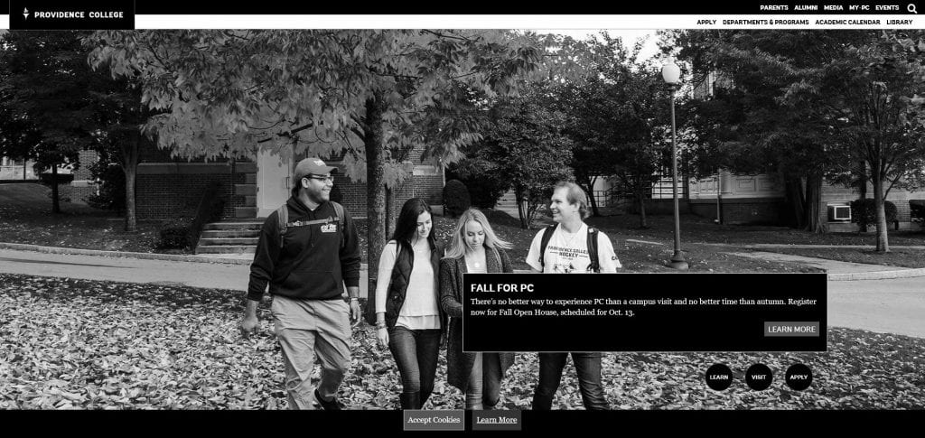
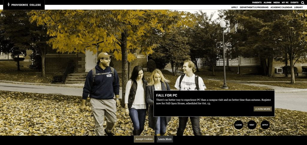
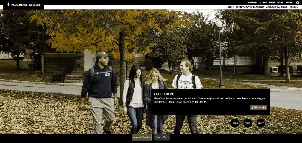
The term users of low vision on this page is a broad term that we’re using to describe a variety of optical conditions. You may find it instructive to see our webpage as users with low vision might see it.
Achromatopsia
Achromatopsia is a lack of color vision.
Blurred Vision

Deuteranopia
Deuteranopia is a form of red/green color blindness.
Protanopia
Protanopia is another form of red/green color blindness.
Tritanopia
Users with tritanopia have difficulty perceiving the color blue.

There are many types of low vision conditions and color blindness. We, as content creators and developers, have a responsibility to create content that offers an equitable experience to all users.
Additional Resources
Designing for users with low vision (UK Home Office)